


Introduction
As the world continues to move toward mobile-first digital behavior, Google’s Mobile-First Indexing 2.0 represents the next major evolution in how websites are ranked and crawled.
If your site isn’t mobile-friendly, you’re not just losing visitors—you’re likely losing visibility in Google Search too. In 2025, mobile-first indexing is no longer optional. It’s the foundation of SEO success.
This article breaks down what Mobile-First Indexing 2.0 means, how it impacts your rankings, and what you can do today to future-proof your SEO strategy.
What Is Mobile-First Indexing 2.0
Originally introduced in 2018, mobile-first indexing meant that Google primarily used the mobile version of a website for indexing and ranking.
With Mobile-First Indexing 2.0, Google has taken this even further — it no longer uses desktop versions at all. If your mobile version isn’t optimized, your entire website’s visibility could drop.
In short:
“If it’s not accessible on mobile, it doesn’t exist for Google.”
This shift aligns with user behavior — over 70% of all web traffic now comes from mobile devices.
Why Mobile-First Indexing Matters in 2025
Google’s mission has always been to provide users with the best possible experience. Since most people browse the web on smartphones, search results are designed for mobile usability.
Here’s why mobile-first indexing matters:
- User Experience (UX) drives ranking — mobile usability is now a key signal.
- Page speed and performance directly affect both SEO and conversions.
- Responsive design ensures consistency across devices.
- Crawling and rendering prioritize mobile-first versions of content.
If your site is slow or difficult to use on mobile, you risk losing both rankings and customers.
How to Optimize for Mobile-First Indexing 2.0
Let’s go step-by-step through how to prepare your website for this new indexing environment.
1. Ensure Responsive Desig
Responsive web design is the foundation of mobile-first SEO. It automatically adapts your layout and content based on screen size.
Checklist:
- Use a single URL for desktop and mobile versions.
- Avoid using separate “m.” domains (e.g., m.example.com).
- Test responsiveness with Google’s Mobile-Friendly Test Tool.
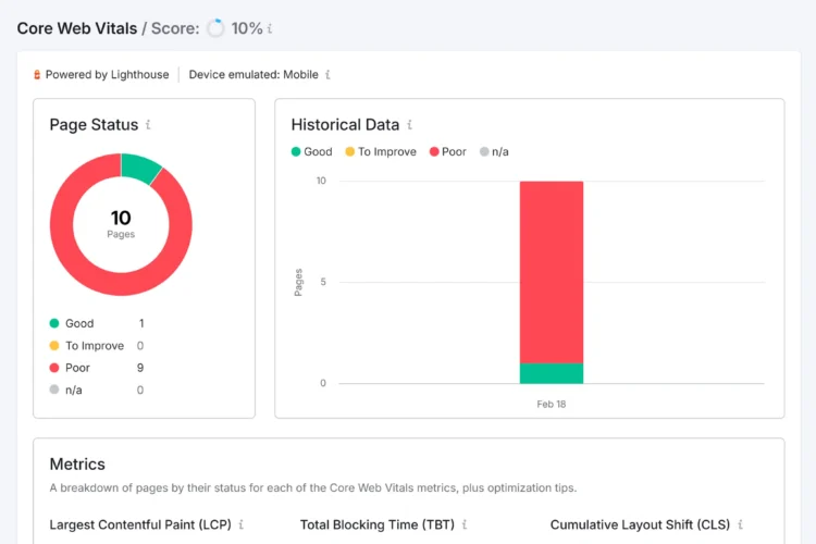
2. Prioritize Page Speed and Core Web Vitals
Google’s Core Web Vitals—LCP, FID, and CLS—are essential for mobile performance.
Tips to improve speed:
- Compress and optimize images.
- Implement lazy loading.
- Minify CSS, JavaScript, and HTML.
- Use a Content Delivery Network (CDN) for faster load times.
- Use tools like PageSpeed Insights or Lighthouse to identify bottlenecks.
A fast-loading, stable page not only helps rankings but also boosts conversions.
3. Match Mobile and Desktop Content
Google expects content parity between mobile and desktop versions.
Make sure that:
- Headings, metadata, and structured data are identical on both versions.
- All images, videos, and internal links are available on mobile.
- Lazy-loaded elements can still be crawled and rendered.
If your mobile version has missing sections or reduced content, Google won’t see that information — hurting your SEO.
4. Optimize for Mobile U
User experience is at the heart of mobile-first indexing.
Best practices include:
- Use legible fonts and adequate text spacing.
- Keep buttons large and tap-friendly.
- Avoid intrusive pop-ups or interstitials.
- Use a clean navigation structure.
Remember: a seamless experience increases dwell time and engagement — both positive ranking signals.
5. Improve Mobile Crawlability
Googlebot primarily uses a smartphone crawler, so your site must be easily accessible.
Check these points:
- Ensure your robots.txt doesn’t block important mobile resources.
- Verify that meta tags like
viewportare set correctly. - Use Search Console’s “Inspect URL” tool to test how Google sees your mobile pages.
6. Leverage Structured Data and Metadata
Structured data helps Google understand your content, even on mobile.
- Use schema markup (e.g., Article, FAQ, Product).
- Keep titles and meta descriptions optimized for smaller screens.
- Add relevant Open Graph and Twitter tags for mobile sharing.
7. Test Your Mobile SEO Regularly
Mobile optimization isn’t a one-time task. Run routine audits to catch issues early.
Essential tools include:
- Google Search Console – for indexing and mobile usability reports.
- Ahrefs or SEMrush – for mobile keyword tracking.
- Small SEO Tools – for on-page audits and performance analysis.
Common Mistakes to Avoid
- Having separate mobile and desktop URLs.
- Hiding or removing key content on mobile.
- Ignoring image alt text and structured data on mobile pages.
- Overloading pages with scripts and pop-ups.
- Forgetting to test user experience on multiple devices.
Avoiding these mistakes ensures you stay compliant with Google’s Mobile-First Indexing 2.0 updates.
The Future of Mobile SEO
In the next few years, AI-driven search, voice integration, and personalized experiences will dominate.
To stay ahead:
- Invest in progressive web apps (PWAs).
- Optimize for voice search and local SEO.
- Monitor Google’s updates on Core Web Vitals and SGE (Search Generative Experience).
The line between mobile, desktop, and AI-assisted search is blurring — but user experience will always be the key ranking factor.
Conclusion
The era of Mobile-First Indexing 2.0 demands adaptability.
If your website isn’t built with mobile users in mind, you risk losing visibility and authority in Google Search.
By ensuring responsive design, optimizing speed, matching content, and prioritizing user experience, you can future-proof your SEO strategy for 2025 and beyond.
Mobile-first is no longer just an SEO best practice — it’s the new baseline for online success.
FAQs
1. What is Mobile-First Indexing 2.0?
Mobile-First Indexing 2.0 means Google exclusively uses the mobile version of your website for crawling, indexing, and ranking. If your mobile site is not optimized, your entire search visibility can be affected.
2. How can I check if my website is mobile-friendly?
You can use Google’s Mobile-Friendly Test Tool or check the Mobile Usability Report in Google Search Console to identify and fix issues affecting your site’s mobile performance.
3. Does Mobile-First Indexing affect desktop rankings?
Yes. Since Google prioritizes your mobile version for indexing, poor mobile performance or missing content can negatively impact your desktop rankings as well.
4. What are the key factors for optimizing mobile SEO?
Responsive design, fast loading times, content parity, structured data, and a user-friendly layout are the most critical factors for mobile SEO under Mobile-First Indexing 2.0.
5. How often should I test my site for mobile SEO issues?
You should audit your mobile site at least once a month using tools like Google Search Console, PageSpeed Insights, and Small SEO Tools to ensure consistent performance and compliance with Google’s latest updates.
Other SEO services include – SEO Agency in Madhapur | SEO company in Ameerpet | SEO services in Hitechcity | SEO services in kukatpally | SEO services in Bangalore